Blog has moved, searching new blog...

Thursday, November 13, 2008

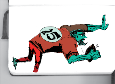
House Poor - Portland Mercury


Here is another illustration I did for this week's Portland Mercury. You can read the full article here.

Friday, October 24, 2008

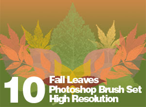
Fall Leaves - High Res Photoshop Brush Set


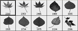
Here is a set of 10 Photoshop brushes that I made. They are free for use on any projects, though you may not sell, redistribute or host them. They are high resolution and were created in Adobe Photoshop version CS3. They were tested in CS3 and CS2, but may not work in earlier versions of Photoshop. Here is a preview of what they look like:Also, I made a color palette from the fall colors in our backyard that is also in the .zip file.The .zip file contains the .abr brushes file and the .aco color swatches file. Load these to their respective folders in your Presets folder. Feel free to let me know what you think in the comments.

Click here, or right click and select 'save as' to download the .zip file.


Enjoy!

Tuesday, October 21, 2008

Free Font - Sewer Rat


I have created an original font and I'm proud to release it here. This is the first font I have designed so let me know if you have any problems with it. Please send me any feedback you may have.

This version only includes a basic set of all caps A-Z and 0-9. This font is fairly detailed in it's texture, but would work well for high resolution or large work.

I could see this typeface used for grunge, punk, rock, skateboard and other designs along that line. It would also work well as a Halloween font - as it is October...

It is a free font so you may use it in anything, even in designs you sell. You just cannot redistribute this font, or host it on a server.

The font is hosted on my website so click here to download it. Or right click and select 'save as'.

Friday, October 17, 2008

Obama 08 Desktop Wallpaper


Here is an Obama poster I put together. I haven't done many desktop wallpapers, this one is sized at 1280 x 1024 so it at least works for my screen. Hope it works for yours.

Thursday, October 16, 2008

Under Cover - Portland Mercury


Here is another illustration I did for the Portland Mercury this week. This is the gray version of it, which appeared in the printed paper. The color version is in the online article. Here is the article.

Thursday, October 9, 2008

Pins and Needles - Portland Mercury


I did this illustration for a news article in the Portland Mercury. It was a fairly simple concept, so I had some fun with the execution of it. You can read the article on their website here.

Saturday, October 4, 2008

Patrol


I never got WAY into painting, but I've been feeling an urge lately to get more into it. This was done in oil paint on a wood panel. I did some color adjustments and text in Photoshop. For the most part it turned out like I wanted, but I had some trouble controlling the brush/paint. Some research on technique should help future paintings.

Tuesday, September 30, 2008

Death Music


Here is a new illo from my sketchbook.

Thursday, September 18, 2008

Portland Mercury - Red Light


Another editorial illustration for the merc. Apparently there's a prostitution problem down on 82nd. It was a black and white assignment so I wanted to play with the shadows a bit. It started off as more of a straight forward shot, but I thought a bit of a dramatic angle would help the whole thing, plus it makes it allow the street sign easier. Read the full article here.

Thursday, September 11, 2008

Portland Mercury - There Goes the Neighborhood


Here's another illo I did for the Merc. The printed version was in grays, so the web version just has a color overlay on it. Read the full article here.

Sunday, September 7, 2008

RipshaW will eat your soul!


Every 10 billion years a force of great power and destruction is born of the earth. The time has come and this force has manifested itself as the power of ROCK! The vessel for which this power is contained is known simply as...

RipshaW

Anyways.. this is my brother's awesome metal band. And this is an awesome t-shirt design I did for him...

rock.

Thursday, September 4, 2008

Portland Mercury - Taser Eraser


This is probably the most fun I've had with the recent illustrations I've been doing. I had a little trouble getting the layout right, but the inking and finishing was a blast! It kinda makes me dizzy looking at it now. BZZZ!

This issue came out today. You can read the full article here.
Thursday, August 28, 2008

Portland Mercury Illustration - Fare Check


Here is an illustration I did for this week's Portland Mercury. It's about how the fares on TriMet (the local public transit system) are going up, without increased service. The concept was presented by the art director, and I did the final draft. You can read the online version of the article here.

Wednesday, August 27, 2008

R.U.R. - T-shirt Design at Design By Humans


I liked that drawing in the last post enough to try it out as a T-shirt design. If you like it and want to see it produced, go on over to Design by Humans and vote for it. Here is the direct link: http://www.designbyhumans.com/vote/detail/25972

Sunday, August 24, 2008

R.U.R.'s Recycled Beats


So originally, this I was working this up for Illustration Friday. But it kind of went in a different direction. The theme was 'routine', but while I mulled that around in my head, at some point it turned into 'repetition'... And while that's a similar theme, I think I ended up fairly removed from the original topic. In the end though I think I came up with a cool piece, and isn't that what really matters when it comes to these free/fun competitions?

Sunday, August 17, 2008

Detach - Illustration Friday


I've been playing with technical illustration a bit lately as well as isometric drawing. And I thought these techniques would work nicely to illustrate the topic of 'detach' for Illustration Friday.

Thursday, August 14, 2008

Crazy Ballot


I did this quick spot illo for the Portland Mercury this week. You can read the full article here.

Sunday, August 10, 2008

Space Sailing - Illustration Friday


An illustration for Illustration Friday. This is what I think a space sail would look like... something like that anyways. Like a big ball of solar panels for energy... might also have mass controls to vary the pull of gravity between planets. I dunno.. makes sense in my head.

Thursday, July 31, 2008

RipshaW t-shirt design - in progress


I'll probably finish this design in the next few days, but I wanted to post the progress on it. After finishing the pencils and doing the inks it will be set up for a one color silkscreen on a t-shirt. Right now I'm thinking white on black for starters, but we'll see when it's done.

Thursday, July 17, 2008

Calling Doctor Cheap-o! - Portland Mercury


This was a quick fun project for THE PORTLAND MERCURY. It's a feature about finding cheap to free healthcare in the Portland area, when you don't have insurance. I had done a little work for the Merc before, but this was my first opportunity to work with the new AD there, Mark Searcy, which went really well.

The issue came out today so run to your nearest Portland, Oregon newsstand and pick one up! (Or just browse the paper on their website...)

Tuesday, July 8, 2008

Sour - Illustration Friday


So I used a little different of a process this week, parts of it I liked and others I didn't. I can see that in the end result. I started off with a pencil sketch. I kind of had a loose idea of how I wanted it to look anyways and I pretty much captured that. I think it would've lost a lot more life had I NOT done a pencil sketch. I scanned the sketch and outlined my shapes in illustrator. I think that's where I went wrong. The illustrator shapes are just a little too rigid. Next time I'll remember that and probably hand draw each shape over a lightbox. I took the pieces into photoshop, messed with layer options and threw in some grunge effects. Then cropped it all down. So I liked some of the process, but I should've done it a little more hand drawn and a little less computer aided. But it's done, thats whats important - and I learned from it.

Sunday, June 29, 2008

Gravity Bomb


Viewer: Jon, what's a gravity bomb?
Me: I dunno, but I want two. One for up and the other for down.

I guess this is a one page comic. I wonder if there are rules or a definition as to how much content a one-page comic has to contain. "Use the gravity bomb" and then the other guy does... I suppose it falls under the 'Conceptual Product Demonstration' comic genre.

So I did this in my sketchbook, and liked it, so it got a bit of a Photoshop treatment and Voila! Now it's online for the world to see. Enjoy World!

Sunday, June 22, 2008

Litterboxx


Well it's been a while since I've done some real comic pages, but this looks like the project that's going to get me going again. I've been getting more comfortable with my inking approach, so I think these are going to be some really solid pages.

It's for a submission to an anthology called SIDE B, and even though it's not due for a while, I figured I should get going on it... especially since my schedule has been a little unpredictable lately.

These are the thumbs for it. The basic story is theres a band of cats called LITTERBOXX that fly around in an octopus space ship and play music for their fans... and theres a anti-music robot that tries to stop them... but the power of rock is just too strong.

Hoard, Illustration Friday


Well, I enjoyed doing this last week, so I'm going to try to get in the habit of it. The theme this week was 'hoard' and as I started to sort out ideas I kept thinking of the definition for 'horde'.. which is different.. Anyways, I looked it up to be sure.

I did a 3 page comic with this 'piggy-bank-for-a-head-man' character a while ago. It just seemed to fit for this idea. If you're interested check out the comic pages here.

Thursday, June 19, 2008

Drawing Words & Writing Pictures


I got a nice little surprise in the mail, it's the new comic textbook from all-star cartoonists Matt Madden and Jessica Abel. I was an intern for Matt and Jessica while they were writing it. I did a character construction exercise that they included in the book, which is really cool.

I mostly saw the outlines and some rough drafts, but I could definitely tell this was going to be big. They've really covered the art of comics from all angles in this book. I'll enjoy going through this in depth and I can already tell it's going to be a great resource.

It's published by First Second and available at Amazon (among other places I'm sure).

Monday, June 16, 2008

Punchline


So theres this thing called Illustration Friday and I've been meaning to participate the past few weeks, but I've been so busy that it's close to the following Friday before it's getting close to finished. This time, I kept it a little simpler. The theme is 'Punchline'. This makes sense to me, but comment if it's too vague. I'm curious if it comes across like intended.

Sunday, June 15, 2008

An Effing Foodie


I have posted about this project before, but hadn't put up the final web banner. The first draft was more of an illustrated cartoony style, but the client was thinking of something a little more elegant. This style works a lot better with the layout of the site. See for yourself at http://www.aneffingfoodie.com/.

Mangia Mix


I was browsing through my past work folders and realized I never posted this project online. Theres a few that slip through the cracks now and then, but this is one I especially enjoyed. Rich has made a business combining two of my favorite things: food and music. He does great music mixes for restaurants in the NYC area. I designed his logo, business card and some miscellaneous stationary.

This is the front and back layout of the business card. I had them printed at overnightprints.com because they're good, cheap and can do those nice rounded corners that I wanted.

Sunday, June 8, 2008

Evil Bird cover


One day I'll have time to actually get some finished pages done for this comic. Still slowly working out some kinks to the story and it's still pretty much on the back burner. But I had a hankering to work on this cover image, so I put it together. The bird was fully inked, but I decided to crop it for design purposes. I played with some photoshop stuff that I hadn't really messed with much before and I'm happy with the results. I was unaware that there were two methods of achieving 'halftone'. I like this one much better. It's filter>sketch>halftone pattern. Although it doesn't seem to be available in CMYK mode. No biggie though for this piece. I also worked with illustrator for the logo, played with gradient and layer options and pulled in and manipulated some grunge textures.

Tuesday, May 27, 2008

Battle Ground Harvest Days 2008


This is a poster design I did for the Battle Ground Harvest Days event put on by the Chamber of Commerce.

I used a new tool (for me anyways) for my inking on this. Its a winsor-newton series 7 size 2 brush. A lot of people have recommended this as the ultimate inking tool (including Tom Pitilli ). I found it incredibly easy to work with and I love the lines I got out of it. It's been a while since I've used a traditional brush (brushpens and foam brushes lately), so I had a bit of trouble figuring out the water/ink workings of it, but I got it pretty much down.

I started using an ink i was excited to try 'fw acrylic artists ink', but the blackness of it was very week. I ended up using a winsor newton ink, which was much darker and cleaner.

Colors were done in photoshop, but I figured out my palette using the color tools in illustrator, based on tips from colorist Ben DeRosa.

Saturday, May 17, 2008

RipshaW


Heres a quick thing I did for my brother's band.

Monday, May 12, 2008

Family Portrait


Found this sketch I did a while ago. Maybe will eventually ink/color, but figured I'd share.

Saturday, April 19, 2008

Random Sketches


I was going through my sketchbook and found a few gems. I'm considering making shirts or something of the pizza=awesome and the robot whistling images. Also, I kinda like the weird Conan O'Brien face...

Thursday, April 17, 2008

Blue Shift - inked


This is the inked version of the sketch I had up the other day. I'm working out a story based on this and hopefully I'll be able to keep up a webcomic. I'll probably do some more experiments in style, but I'm very happy with this image.

Tuesday, April 8, 2008

Battle Ground Little League


This is a banner I designed and printed at work for the local baseball little league group. They were very happy with the final product and apparently are getting a lot of good comments at their tournaments.

Sunday, April 6, 2008

Blue Shift


Here is an illustration that I'm working up as part of some concept sketches for a new project. I'm planning on using a 2 color press to make prints of the final illo using blue and black.

Thursday, March 27, 2008

Vancouver Voice - April Cover


A last minute job, I was able to do the cover for the April issue of the Vancouver Voice. I was called on Tuesday, luckily the AD had some ideas already - I worked out the sketches and submitted them that night. They picked one and I did the final workup (ink and photoshop color/texture) on Wednesday night. Personally, I favored my other sketch, but this image works better with the story I'd have to agree.

Tuesday, March 11, 2008

Vinyl graphics


I figured this was worth a post. I designed this partial vinyl car wrap at work for 'Timberman's Tree Service'. The main body wrap is around 12' x 7'...so, it's pretty big. I didn't do much on the actual install, but the overall design was me.

Sunday, March 2, 2008

PANDA!


Last weekend Heather and I went to Wondercon in San Francisco and stayed with our friends Chris and Carolyn in the Sacramento area. It was great to see them and hang out. They requested the above illustration from me, which I was more than happy to work up. They liked the inked version, but I wanted to take it home and color it. Took a few days, but there it is!

Trickster


Here are some loose sketches for the short story I'm working on for the Trickster anthology. I'm in the middle of inking it right now and it's coming along great. It's been a while since I've done actual 'sequential' work, so it's a nice change of pace. It's definitely tougher than a single illustration though, for me at least. I'm a little behind schedule on it and will still need to color it when the inking is finished, but it's getting there. With the rate I'm going right now, I should be done by St. Patty's Day.

Wednesday, February 27, 2008

Gabriel Byrne


I did this caricature of Gabriel Byrne for the March issue of The Vancouver Voice. It's for a review on the TV show 'In Treatment'. The likeness was tricky, but my wife, Heather, helped me get that straight. It was a rush job and they pretty much had what they wanted in mind, so it went fast. I did it a rounder, more cartoony style than usual, more like some work from a few years ago.

Thursday, February 14, 2008

Test coloring

I figured it'd be a good idea to test my 'coloring in illustrator' idea for my Wondercon promotional piece. Above is a sample I saved out. I wanted to try Illustrator because it has a Live Color option, which basically makes it insanely easy and fast to adjust all the colors on a piece. I found a ton of combinations I liked with this piece, including this 'high contrast' type of combination. Once I get colors all set, I'll pull it into Photoshop and do some shading and highlight tweaks. I think this method might work well. Adjustments to the pencil tool made it easy to outline the shapes. The only downside I can see is having to choose one scheme...

By the way, if you have Adobe Illustrator CS3, it's possible you don't even know about Live Color. This is the first time I've used it myself. It's not the most obvious tool, but a very powerful one. Here is the path to get to it: first, select color shapes to edit, then go to - Edit > Edit Colors > Recolor Artwork .

Valentine's Marshmallows!


My lovely wife, Heather, made some Valentine's Day themed marshmallows. She's been making awesome homemade marshmallows every few weeks for the last couple of months. This time she added a little red food coloring to make them pink, and used a heart shaped cookie cutter to separate them out.

More pictures on Flickr.

Wednesday, February 6, 2008

SUPERTRASH

Last Sunday I went to the SUPERTRASH film festival in Portland. The festival was all weekend, but I could only make it for a while on Sunday. It was held at the Baghdad Theatre/Pub. It was the first time I'd been to that theatre and it was pretty neat. The theatre had every other row ripped out and replaced with a bench for food and drinks. I went with my father-in-law Randy and we split a pitcher of Terminator Stout and some popcorn.

The exhibition was small, in the lobby. I took some photos of the pieces that can be seen here. It was fairly packed when I went through so I didn't get too many pictures, but I did get at least one of mine and my friends who submitted. Here is the piece I submitted (from a previous post).

I overheard someone say the liked Ulises' 'Deathrace 2000' poster. And when I went to look at the purchasable prints, the seller said someone had inquired about my poster. (I'm sure Gabe's and Ben's were also big hits, I just didn't here them mentioned). My favorite poster overall was probably the one for Samuel Fuller's THE STEEL HELMET. It was just very well done. I also liked seeing DASH SHAW's interpretation of EXORCIST 2.

There were a lot of great movies playing there, but most of them I'd seen already. I hadn't seen ROBOCOP 2 before (or at least didn't remember it) so we stayed for that. It was not the best print of the movie, but neat to see it on the big screen.

I think they are still accepting submissions for future shows and a possible book published by FANTAGRAPHICS. More information can be found on their MySpace page.

Thursday, January 31, 2008

Ominous Cat Logo


By the way, my freelance art and design business name is OMINOUS CAT. I had a few names mulling over in my head on the way to the courthouse the first time I signed up for a business license.. That is what popped out when it came down to it. Other runner up names were: LEVEL UP and... maybe some variation of my name... SPERRYART... kinda lame. I guess i don't remember all the runner ups, it was a while ago. Anyway, I've embraced the name since that confusing day at the downtown Manhattan courthouse.

I decided to update my logo a bit. The older logo is just on my business cards and invoices, so chances are you haven't seen it. It was the same basic structure, just less ominous.

Wednesday, January 30, 2008

Bunnies!


Here is a bit of a 'spec' illustration for something I'm working on. I think the client wants to go in a slightly different direction with the project, but I like the way this piece came out.

Monday, January 28, 2008

An Effing Foodie


Here is a web banner that I am working up for An Effing Foodie, a wonderful food and review blog. It's not quite working for me in this direction so I think I need to take a few steps back on the project and rethink it a bit... it may just be a matter of recoloring and rearranging some of the elements... we'll see. I figured I'd share where it's at anyway. And check out Effing Foodie. Especially you New York Foodies!